Monday, June 6, 2011

Week 9: LA County Station Fire


      In 2009, there were a series of 63 wildfires that went off in California due to red flag warnings, and the Los Angeles county fire station fire was one of them. It was the largest and most hazardous wildfire that erupted that year. It burned 251 square miles of land in the LA county and took the lives of two firefighters. It started in the Angeles National Forest near State Highway 2 in which it burned on Mount Wilson. The fire threatened 12,000 structures and communities of the City of Los Angeles. The station fire start August 26, 2009 and was fully contained by October 16,2009. 
     The station fire was a very devastating fire and effected many of the local surroundings. Residents were to evacuate immediately, leaving their homes and other important belongings as they fled. Critical communication centers were located on Mount Wilson and many were damaged, and it caused a 40 mile stretch of Angeles Crest Highway to shut down.
    I have created two maps that reference and depict the LA county fire station incident. The top map shows the LA county in its entirety and elements such as the fire extent, population sizes, and available hospitals in the county. The fire extent was provided on the class website. I was able to find data on the 2000 census population sizes in various tracts in the LA county from the UCLA GIS webpage. The yellow tracts on the map represent the greatest number of people in the county, numbering to more than 8,000 people whereas the light green portions consist of the fewest number of people, less than 2,700 people. As you can see from this map, the fire did not effect areas of high population. This map also shows the locations of hospitals in the county, and as seen from the map, hospitals were not in range of the fire. The fire did extend to some areas of higher population but not to those most populated.
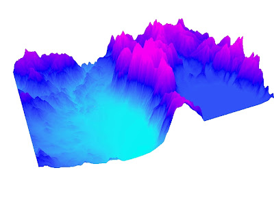
    The bottom map is a reference map of the station fire. It depicts the LA county area and of the landscape form. I acquired a digital elevation model of the LA county from the USGS Seamless Data server. I also gathered data of the highways in the county from the Los Angeles GIS website; the highway was included in the map so that the reader would have a better understanding where the fire was located relative to the freeways. As it is shown on this map, the fire was burning in high elevations given the lighter area in which it occurs on the map. The data on the fire extent was also gathered from the course website provided in the previous map.
    
 Work Cited
"LA County." Mapshare: UCLA's Spatial Data Repository. University of Los Angeles, 2010. Web. 7 Jun 2011.    <http://gis.ats.ucla.edu/Mapshare/>.
  
"The National Map Seamless Server." Seamless Data Warehouse. U.S. Department of the Interior and U.S. Geological Survey, 28DEC2010. Web. 7 Jun 2011. <http://seamless.usgs.gov/index.php>.  

"Los Angeles County GIS Data Portal." Los Angeles County Enterprise GIS. Los Angeles County GIS Data Portal, 2011. Web. 7 Jun 2011. <http://egis3.lacounty.gov/dataportal/>.   

"L.A. County fire doubles in size; more homes destroyed; Mt. Wilson threatened [Updated]." Los Angeles Times 31AUG2009: n. pag. Web. 7 Jun 2011. <http://latimesblogs.latimes.com/lanow/2009/08/la-county-fire-doubles-in-size-more-homes-list-mt-wilson-threatened.html>.

 "Station fire claims 18 homes and two firefighters." Los Angeles Times 31AUG2009: n. pag. Web. 7 Jun 2011. <http://articles.latimes.com/2009/aug/31/local/me-fire31>. 

Monday, May 23, 2011

Week 8: Census 2k ArcGIS


   The Population Density, 2000 Map shows the population density in units of people per square mile of each county in the U.S. The calculations were made by taking the units of people in the Tab01.APR01_2000 table and dividing it by the the area in the Counties.AREA table given in square miles. The color ramp chosen for this map makes it easier for those reading the map to see which county is more densely packed, moderately densely packed, and not densely packed with people. Among the various greens, the Dark Navy Blue counties indicate which counties are dense easily. The very light shades of green tell the map user that it is not dense in that county.
    The Percent Change, 1990 to 2000 Total Population Map shows the change in percentage of total population in the counties from year 1990 to 2000. The values were taken from the table provided to us in class. The dark purple counties, that depict the highest percentage in change in population from 1990 to 2000 and that total population in those counties increased greatly, are easy to distinguish from the counties that had negative population change, in that total population for that county decreased from 1990 to 2000. The counties in purple tell us that those counties had increase in population form 1990 to 2000, and the tan, yellow counties tell us that those counties had a decrease in population from 1990 to 2000.
    The Number of People, 2000 Map shows the number of people per county in the US. in 2000. The values were taken from the table provided to me from class. The color ramp of light purple to dark purple is appropriate because we are only looking at the number of people. The light purple tells the map user that those counties have less people than the dark purple counties which have more people.
    The Difference, 1990 to 2000 Number of People Map shows the difference in the number of people in each county from 1990 to 2000. The values were taken from the table provided to me from class. There are two different colors. The pink colors represents a decrease in the number of people in a county from 1990 to 2000 and the green colors represents a increase in the number of people in a county from 1990 to 2000. The two colors are different enough that it is easy to distinguish which counties overall had an increase or a decrease in number of people in a county.

Monday, May 16, 2011

Week 7: DEMs in ArcGIS


    These are maps of Lake Tahoe, California. I selected this area because it has a huge lake that is surrounded by mountains, and I thought it would be an interesting spot to map. It a has many different elevations which makes it a grand place to ski and snowboard in the Winter. The extent of this area at the top is 39.06, left is -120.15, right is -119.56, and bottom is 38.68. It uses the GCS North American 1983 coordinate system with a North American 1983 datum.

Monday, May 9, 2011

Week 6: Projections in ArcGis

 
    The GCS world map has a coordinate system based on a 3D model of the Earth. It is a conformal map in which direction, shape and angles are preserved on the map.The projection has distortions as well; Distance and Area is distorted. The distance from Washington DC and Kabul is shorter in the GCS world map. The distance between the two cities can be explained by the horizontal stretch of the map. Such a stretch is indicated by the size of Antarctica and Greenland; these two land masses appear more wider and horizontally stretched. Also The GCS world map depicts distortion of these two land masses; they are seen to be very large. Greenland looks to be comparable in size with the United States. 
    The Mercator map is also a conformal map because it too has meridians and parallels that intersect to form right angles. The Mercator map preserves the direction, angle, and shape as well. The Mercator map distorts distance and area too, however it distorts the map a different way. The Mercator map stretches the map vertically. The distance between Washington DC and Kabul is further away than the GCS map because the map itself is stretched in a vertical direction. Land masses are not being pushed closer together by extending horizontally as with the GCS map. The area of Antarctica and Greenland are elongated and appear to be very large. Again, Greenland looks larger than it is and even looks larger than the United States due to its vertical stretch.

    These two maps are both equal area maps. The top map is called Cylindrical equal area map and the bottom is a Bonne equal area map. The areas of land masses are preserved and the shape, distance and angles are distorted in both projections. The Cylindrical map is made by the use of a cylinder. You can image a cylinder being wrapped around the Earth and then projecting onto the cylinder, and subsequently unfolding the cylinder. 
    The Bonne map is a pseudoconical equal area projection. All parallels are circular arcs with a common central point, and meridians are not straight lines. Parallels are equally spaced and are all standard lines. Its shape distortion is acceptable except far from the center. For construction, one parallel at the sphere is chosen, and a cone tangent at that central parallel is built. The parallel's radius at the map is the same as the radius along the cone. All other parallels's radii are marked accordingly.


   Both these maps are equidistant maps. The top map is the Aitoff Equidistant map and the bottom map is the Equidistant Cylindrical map. In theory, both maps should have the same distant from Washington DC to Kabul, however they are different because it is most likely that the reduction rate, or scales, are not constant. Also the shortest distance between two points on a sphere is rarely represented by a straight line on a flat map, and measuring distances along an arbitrary, or not always marked, curve is not a straightforward procedure. 
    The Aitoff map is a modified azimuthal map projection in terms of its equatorial aspect of the map. There is great areal exaggeration near the map boundaries. There is equidistant only along the Equator and central meridian. Doubling longitudinal values enabled the whole world to fit in the inner disc of the map; the horizontal scale was then doubled, creating a 2 : 1 ellipse.
    The Equidistant Cylindrical map is only equidistant at the meridians and at two parallels. It distorts shape and area. It is a cylindrical projection with standard meridians. All meridians are standard equally-spaced vertical lines, and all parallels are horizontal, equally-spaced, equally long lines. This map resembles the construction of tightly rolling an cylindrical sheet against the Equator and having every meridian drawn on this tube by light rays emanating from an equatorial point on the meridian directly opposite, however it not truly created by a perspective method.

Tuesday, May 3, 2011

Lab 4: ArcGIS Tutorials

Exercise 1


Exercise 2


Exercise 3

Exercise 4


Exercise 5


    This lab was not a difficult lab however it still posed various challenges for me during the whole process. The first exercise I finished in class during our lab section. I had no problems at the time. I read and followed the directions and was able to complete the exercise with relative ease. And because I thought it the rest of the exercises would be similar, I did the rest outside of class time and from computers that were not in the lab.
    The other exercises were not hard as well, but I came across many challenges. First of all, the lab itself was very tedious and time consuming, however the directions were very easy to follow. I did have to go back and forth constantly, checking to see if I clicked the right button or followed the right directions when I was suppose to, but it was not a difficult task. I had trouble finding certain stuff in the program because I was not familiar with the technicalities of the ArcGIS. Other than that, the lab processes was relatively easy.
    I had a lot of problems with how I saved my work though. There were times were I had to locate the layer files from my USB drive, and later when I went back to look over my work, I would get an exclamation point next to the new data frames I created because the program was unable to locate those layers. I thought I saved my files and layers onto my USB drive, but for some reason the program would not read the information off of it. So I had to start over and drag my whole folder onto the computer and work off the computer itself. After I was finished, I dragged the the folder back onto my USB drive. I had to contact my friend that was in Advance GIS for help when such incidents were occurring. I essentially had to redo all the exercises because I saved the layer files in the wrong place. It was very fustrating, but I must admit, going through the exercises a second time did help me get to know the program better.
     I felt the lab itself was worthwhile because I do feel better acquainted with ArcGIS. The program is no longer as intimidating as I thought it was going to be. I like knowing that I have some what of a grasp on what the program is about and the technical terms associated with using the program. The lab served as a good introduction to the use of ArcGIS.

Tuesday, April 12, 2011

Week 3: Neogeography


View My trip to China in a larger map

     Neogeography is useful in terms of narrowing the ideas of one's perspective. The map created helps organize an individuals ideas. It helps clarify the ideas an individual has through the use of maps. The map created helps the reader understand the map creator's ideas. An individual can personalize the map they create and use it to serve their purpose be it to tell a story of their travels or to focus the reader's attention to a particular area.
    Neogeography has certain consequences as well. The information the map creator includes in their map can be wrong. The creator can include anything he/she wants due to the lack of authority monitoring the creation of these maps that anybody can create which includes both professionals and amateurs alike. Those who use the map may find unnecessary information included in the map that does not apply to their purpose. Such neogeography maps tend to serve few in use since it was created to mainly serve a narrow purpose.

Monday, April 11, 2011

Week 2: USGS Topographic maps

1. Beverly Hills Quadrangle

2.  Canoga Park, Van Nuys, Burbank, Topanga, Hollywood, Venice, Inglewood

3.  1966

4.  North American Datum of 1927, North American Datum of 1983, National Geodetic Vertical datum of 1929

5.  1:24,000

6a. 1200 m
6b. 1.89 mi
6c. 2.64 in
6d. 12.5 cm

7. 20 ft


8a. 34 d 4’30” N, 118 d 26’ 15” W; 34.075 degrees N, 118.434 degrees W
8b. 34 d 0’ 28” N, 118 d 29’ 0” W ; 34.0078 degrees N 118.483 degrees W
8c. 34d 6’ 15” N , 118d 24’ 45” N; 34.0042 degrees W, 118.4125 degrees W


9a.  600ft,  182.88 m
9b.  140 ft, 42.67m
9c.  800ft, 243.84 m

10.  zone 11

11. 37630000 ft N, 3620000 ft W

12.  1,000,000 sq. meters 

13.


14.  +14

15. south

16. UCLA Campus